I am currently at the Masters Summit for QlikView in San Francisco attending Bill Lay‘s session on QlikView data visualization. Besides hilarious delivery, Bill is showing some pretty cool visualization examples and tricks.
One thing Bill was showing are various ways you can add annotations to charts, putting them either on the axis or in the legend. One additional view that Bill and I discussed earlier is to put the annotations on the data point. Bill just asked me if there was a blog post about it. There wasn’t, but there is now. Not as polished as usual, but you’ll get the gist by looking at the QVW attached below.
During my internship at Bitmetric one of my project goals was to build a QlikView application to benchmark logistical companies. I needed to visually compare the results of one organization with the average results of all organizations. My first try was using a combo chart with symbols, but I wasn’t happy with how that looked:
The dot seems to reflect an interval instead of a value. What I really wanted was to make is a chart that uses a straight line for the benchmark:
In this blog I will show you how you can make such a chart.
A short post today, but one that will fix a very common developer annoyance in QlikView 11 and 11.2; the scroll tabs in the chart properties dialog window. When you want to change properties on tabs that are on opposing sides of the tab row (for example, Dimensions and then Layout) you first have to click the scroll arrows before you can select the tab. Extremely annoying, if you ask me.
A little while ago, I was asked to change an existing QlikView Application. While scanning the application, I found that it used Alternate States. I had already heard about Alternate States, and that they could store different user selections, but didn’t have any hands-on experience yet. I decided to dig a bit deeper into the subject before continuing. I wrote down what I learned in this post
Two questions from business users that will probably sound familiar to most QlikView Developers:
“We currently use this report. Can you re-make this in QlikView?”
and
“Our graphics designer came up with this dashboard. Can you do that in QlikView?”
Quite often you’ll find the answer to be yes. Although admittedly, you often may also want to suggest another approach, especially when asked the first question.
Recently I was asked if the following chart could be built in QlikView:
As you can see, this chart compares relative-to-total amounts for two periods. There is a vague area that connects both bars and kind-of-but-not-so-much shows the change between the periods. I had to think a bit harder before responding to that question…
Christmas time is coming near and I’m in a festive mood, so today I have a short post to wish you all a Merry Christmas and a Happy New Year!
Of course, it wouldn’t be a QlikFix Christmas if I hadn’t whipped up a little visual effect in QlikView. Without further ado, here is my QlikView Christmas card to you:
But wait, there’s more! Inspired by the Christmas theme over at Matt Fryer’s QlikView Addict blog (a recommended read, by the way), I decided to create a small document extension that lets you add a little Christmas spirit to your own QlikView documents. Amaze (or annoy) your clients, co-workers and users! For example, how about adding a little snow to the golf course? read more »
With so many people commenting positively on my previoustwo pointless-but-pretty visual effects in QlikView, I’ve decided to make it an irregularly recurring Friday-afternoon series. At least, until I run out of ideas or opportunities to build these applications.
This time I’ve created an animated fire effect using a scatter plot. Like the previous two effects it has absolutely no practical application, unless you’re pitching QlikView to Industrial Light & Magic 😉 The video below demonstrates the effect.
If you want to try the application for yourself, you can download it by clicking the link below. Beware that the application is quite memory-hungry, you’ll need at least 4GB to run the app.
After the many enthusiastic responses to last week’s post on visual effects in QlikView, I’ve decided to post one more pretty-but-pointless animated chart before returning to the serious stuff. This time I’ve created a plasma effect using an animated scatter plot in QlikView. The video below demonstrates the application.
If you want to try out the application yourself, you can download the full application below.
Today’s post comes to you straight from the Department of Useless-But-Fun Stuff.
Many people have seen Hans Rosling’s informative (and very entertaining) presentations in which he uses his Gapminder software to present data in animated scatter plots. With the Animate Dimension function, QlikView offers similar functionality to create animated charts.
Unfortunately, as many have discovered, animating charts in QlikView does not immediately make them informative or entertaining. In fact, the opposite is quite often the case; boring data is presented in an animated form and becomes even more tedious.
Curious to see if I could create an animated chart that, while maybe not informative, at least looks pretty, I decided to create a chart based on Lissajous curves. You can see the result, which uses a standard scatter plot, in the video below. The video contains cheesy music, so check the volume level before pressing play.
Of course, this chart lacks any practical application, but I find that it does look quite cool. Incidentally, this is also the only case in which the use of shiny spheres in a scatter plot is permissible. Should you want to play around with the app, it can be downloaded below.
After my previous post about variables, I got an interesting question from DV. He asked me about the reuse of chart expressions by referencing the label of another expression (“label referencing”), and what the performance implications of using variables and label referencing versus direct expressions are.
I use variables and label referencing extensively in my applications, but I never really tested what this means for performance. I have always assumed that using variables instead of direct expressions would have a slight impact on performance. I also suspected that using label referencing would result in significantly better performance (I will explain this later).
But was this really true? Triggered by DV’s question, I set up a small experiment to test my assumptions.


 In this blog I will show you how you can make such a chart.
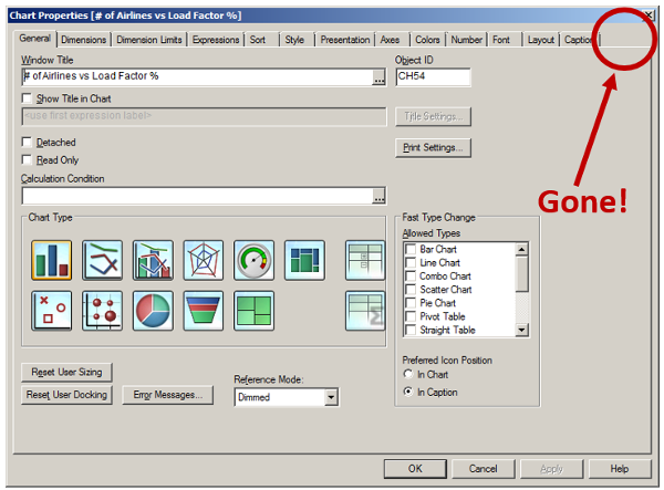


 After my previous post about variables, I got


